How to Optimize Your Event Website For Usability and Conversion

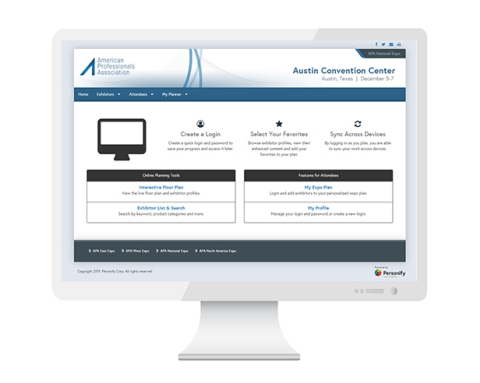
Event professionals and trade show organizers know it’s crucial to create an event website that is not only visually compelling but also easy to navigate and intuitive. We’ve been sharing tips and tricks to help content creators develop event websites that are an end-user’s dream. If you haven’t read about why content creators should care about their event websites, get caught up here.
In part two, we’re sharing a few best practices to consider when developing a website that is designed for event and conversion optimization:
Know when to use visual illustration versus plain text.
This decision can be a challenging one. Plain text content allows your copy to be indexed by search engines and rank for specific keywords, but that you should still make visual illustrations a priority on your event pages. Consider alternatives like infographics and full-width data points, or experiment with large type to create contrast and break up your content. Users are 10 times more likely to spend more time on your homepage if the narrative and content is visually enticing, so make sure to design a website that is not only practical but also beautiful and engaging.
Provide a clear call to action (CTA).
You know the old saying that less is more? Think of your CTAs in the same way. They should be concise, brief and to the point. While we love clever CTAs that are unique and differentiate your company, don’t make your users think or create confusion about where the button will lead them.
Our recommendation for a simple yet effective CTA: Consider simply an H1, maybe an H2 and then a visual action item, such as a button. Don’t over-think this step. Your CTAs should be persuasive and easy to access on all devices.
Sell your event with visuals and strong photography.
Try to use photography that is shot directly at an event, as opposed to using another run-of-the-mill stock photo that half of the industry has on their event websites. While there are diamonds in the rough when it comes to online stock houses, it can take a lot of time to source the right image that supports your brand and sets your site apart from others.
A trendy approach as of late is using gradient backgrounds or monotone imagery. Give it a shot! Whatever you do, make sure that the photography reflects your attendees, exhibitors and sponsors and make sure that it speaks to your audience. This is key.
Ensure color contrast and accessibility.
According to the Web Accessibility Initiative, the Web is designed to work for all people, regardless of the software or hardware they use, the language they speak, their culture of origin, their physical and mental abilities, and their location in the world. When the Web achieves this goal, its content can be accessed by people with a diverse range of hearing, movement, sight and cognitive abilities.
Take this to heart. Consider leveraging online tools like Contrast Ratioor a WCAG 2.0 Contrast Grid from Eightshapes to enhance color contrast and accessibility challenges for your users. Make sure that your text can be read by all users and is ADA compliant.
Think about your content hierarchy and white space.
You may not spend much time thinking about the white space on your page. In fact, most of us tend to focus on the copy, graphics and other assets that live on our event websites and not the white space itself. But white space is an important part of website design that can affect your attendees’ perceptions and their subsequent experience on your website.
Adding white space between paragraphs and in the margins has proven to increase comprehension by 20 percent. A large percentage of websites in the event space suffer from this challenge. It’s as simple as establishing a hierarchy between elements like H1-H5, paragraphs, horizontal rules, testimonials and many more. Legibility plays a huge role here.
Don’t forget a contact page.
Have you ever purchased a piece of software and then realized that the only place to contact the support team for more info is Twitter? If so, you know how frustrating it is to dig for contact information and not know when you will receive a response.
When developing your contact page, don’t include a massive list of names with email addresses and phone numbers. Organize your contact information based on your users’ needs and include the most frequent email addresses upfront. Your future registrants will thank you for making their lives easier.
Also consider creating a page with frequently asked questions about registration, billing, accommodations, transportation and more. You’ll provide registrants with more of the information they need upfront and save your staff time from having to answer these questions repeatedly.
If you’re looking for a compelling events management and optimization solution that can help take many of these best practices into consideration, take a look at A2Z Events by Personify. Our suite of solutions can help event organizers engage attendees, delight exhibitors and grow their events.
Don’t miss any event-related news: Sign up for our weekly e-newsletter HERE and engage with us on Twitter, Facebook, LinkedIn and Instagram!


Add new comment